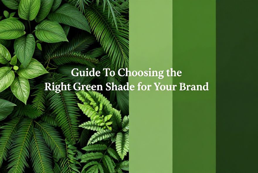
Welcome to the ‘Guide To Choosing the Right Green Shade for Your Brand’! Ever noticed how a splash of green tells a different story every time? From signaling eco-friendliness to whispering luxury, the right hue can make your brand memorable—or send the wrong signal. This blog post’s your go-to manual for navigating green’s subtle whispers and bold declarations, highlighting why your competitors’ choice might be more insightful than you think. So, is your brand ready to get its green on and no, we’re not talking St. Patty’s Day? Let’s get rolling!
Key Takeaways
- Discover why different green tones can change everything for your brand’s image.
- Find out which green shades shout ‘eco-friendly’ versus ‘luxury’.
- Check out how your competitors’ green can affect your brand’s success.
- Learn why a fresh, growth-oriented green might be your secret weapon.
- Eco-conscious consumers love a brand that knows its greens—do you?
- Thinking about going green? See which shades suit your brand identity best.
Understanding the Psychology Behind Green Shades in Branding
You know that moment when you see a brand’s color and instantly feel something? That’s the magic of green at work. Green isn’t just a color—it’s a psychological powerhouse that taps into our deepest associations with nature, growth, and trust. When you’re choosing the right green shade for your brand, you’re not just picking a pretty hue; you’re making a statement about who you are and what you stand for. The psychology of green is fascinating because it operates on both conscious and subconscious levels. Different green tones trigger different emotional responses, and understanding these nuances can mean the difference between a brand that resonates deeply with your audience and one that falls flat. Let’s dive into how green shapes perception and why getting this decision right matters more than you might think.
- Trust and Stability: Green is universally associated with trust, making it ideal for financial institutions, healthcare brands, and eco-friendly companies. Studies show that consumers are more likely to trust brands using green because it evokes feelings of safety and reliability.
- Growth and Renewal: Lighter, brighter greens signal growth, vitality, and new beginnings. If your brand is about innovation or expansion, these tones communicate forward momentum and positive change to your audience.
- Nature and Eco-Consciousness: Deep, natural greens connect directly to environmental responsibility. This shade is perfect if sustainability is central to your brand identity, as it instantly communicates eco-friendliness without saying a word.
- Calming Effect: Green has a naturally soothing quality that reduces stress and promotes relaxation. Wellness brands, meditation apps, and mental health services benefit tremendously from this psychological property.
- Wealth and Luxury: Deeper, more muted greens—think forest green or sage—are associated with wealth, exclusivity, and sophistication. High-end brands often leverage these tones to signal premium positioning.
The Competitive Landscape: What Your Competitors Are Already Using
Here’s the thing about color strategy that most brands overlook—your competitors’ choices matter more than you’d think. When you’re scrolling through your industry, you’ll notice patterns. Environmental companies cluster around bright, fresh greens. Luxury brands gravitate toward forest and sage tones. Financial institutions stick with trustworthy, muted greens. Why? Because these choices work, but here’s where it gets tricky: if everyone in your space is using the same green shade, how do you stand out? The competitive landscape of green shades isn’t just about picking what works—it’s about picking what works for you while differentiating from the noise. Let’s explore what’s happening in your market right now.
- Industry Clustering Effect: Tech startups favor bright, energetic greens (think lime or neon green), while traditional financial services stick with deeper, more conservative tones. Knowing where your competitors land helps you either join the conversation or deliberately break away from it.
- Market Saturation in Popular Shades: Certain green shades are so popular in specific industries that they’ve become almost generic. If your direct competitors are all using the same shade, you’re fighting for visibility in a sea of sameness.
- Differentiation Opportunities: Sometimes the smartest move isn’t following the crowd—it’s choosing an unexpected green shade that makes your brand memorable. Brands that take calculated risks with their green choice often achieve stronger brand recall than those playing it safe.
- Regional and Cultural Variations: What works in Western markets might not resonate in Asian markets, where green carries different cultural associations. Understanding your competitor’s global strategy can reveal gaps in the market.
- Emerging Trends in Green Selection: As sustainability becomes mainstream, the palette of acceptable greens for eco-brands is expanding. Muted, earthy greens are trending over bright neons, reflecting a shift toward authentic, understated sustainability messaging.
Eco-Friendly Green Shades: Building Trust Through Nature-Inspired Colors
When you’re positioning your brand as environmentally conscious, the green shade you choose is basically your brand’s promise. Eco-friendly green shades aren’t one-size-fits-all—they span a spectrum from vibrant to muted, each carrying slightly different messages. The best eco-friendly greens feel natural, authentic, and genuine, because let’s face it, nobody trusts a brand that looks like it’s faking environmental consciousness. The goal here is to choose a green shade that communicates sustainability without screaming it. It should feel like a natural extension of the earth itself. Let’s break down which green tones work best for eco-brands and why they resonate with environmentally aware consumers.
- Sage Green—The Understated Eco-Leader: Sage green is having a moment, and for good reason. It’s muted, earthy, and sophisticated—perfect for brands wanting to show they’re serious about sustainability without being loud about it. This shade suggests maturity, thoughtfulness, and genuine environmental commitment rather than trendy greenwashing.
- Forest Green—Deep Trust and Natural Heritage: Forest green evokes old-growth forests and natural preservation. It’s darker, more serious, and works beautifully for brands emphasizing conservation, heritage, or deep-rooted environmental values. This shade pairs well with premium positioning in the eco-space.
- Olive Green—Earthiness and Authenticity: Olive green is like the comfortable, worn-in jacket of the green palette. It feels natural, slightly vintage, and wonderfully authentic. Brands using olive communicate that they’re connected to the earth and honest about their environmental journey.
- Seafoam and Mint—Freshness Without Fakeness: These lighter greens signal new beginnings and fresh energy. They work well for eco-brands focused on innovation or younger demographics. The key is ensuring these shades don’t veer into artificial-looking territory, which would undermine your authenticity message.
- Avoiding Neon Green in Eco-Branding: While bright greens can work for certain contexts, neon or electric greens can actually harm eco-brand credibility. They feel artificial and processed, which contradicts the “natural” message you’re trying to convey. Save the neons for other applications.
Growth-Oriented Greens: Signaling Progress and Expansion
If your brand is about growth, expansion, or positive momentum, your green shade needs to feel energetic and forward-looking. Growth-oriented greens are typically brighter, fresher, and more vibrant than their eco-conscious cousins. Think of startups, financial growth platforms, and innovation-focused companies—they’re using greens that literally feel like they’re moving upward. The psychology here is that these brighter greens trigger associations with vitality, abundance, and possibility. When customers see your brand’s green, you want them to think “opportunity” and “progress,” not just “sustainability.” Let’s explore which green shades communicate growth most effectively.
- Vibrant Lime Green—Energy and Innovation: Lime green is the startup darling for a reason. It’s bold, energetic, and impossible to ignore. This shade works brilliantly for tech companies, fintech platforms, and brands positioning themselves as disruptive innovators. The downside? It can feel young or inexperienced if not paired with mature design elements.
- Kelly Green—Balanced Growth Energy: Kelly green sits between forest green and lime, offering growth energy with a bit more sophistication. It’s energetic without being aggressive, making it perfect for established companies entering new markets or scaling up their operations.
- Emerald Green—Premium Growth: Emerald is vibrant but refined. It communicates that your growth isn’t just about expansion—it’s about quality expansion. Luxury brands and premium services use emerald to show they’re growing their reach without compromising standards.
- Spring Green—Renewal and New Beginnings: This fresh, optimistic shade is perfect for brands emphasizing rebirth, transformation, or new chapters. It feels hopeful and progressive, ideal for companies pivoting or launching revolutionary products.
- The Saturation Factor: Growth-oriented greens work best when they’re highly saturated and bright. Muted growth greens lose their energy and can come across as tired or uninspired. The vibrancy is essential to the “momentum” message you’re conveying.
Luxury Green Shades: Sophistication, Exclusivity, and Premium Positioning
Here’s something that surprises a lot of brand builders—green can absolutely signal luxury. We often associate luxury with gold, black, or deep purples, but the right green shade? That’s the sophisticated secret weapon of high-end brands. Luxury green shades are typically deeper, more muted, and incredibly refined. They whisper rather than shout, and that restraint is precisely what makes them feel exclusive. When you’re choosing a green for premium positioning, you’re looking for shades that evoke heritage, timelessness, and understated elegance. These aren’t the greens of environmental movements or tech startups—these are the greens of old money, established expertise, and refined taste.
- Forest Green—The Heritage Choice: Deep forest green is the classic choice for luxury brands. It suggests longevity, tradition, and established excellence. Think luxury hotels, high-end fashion houses, and premium financial advisors. This shade says, “We’ve been here forever, and we’re not going anywhere.”
- Bottle Green—Sophisticated Depth: Bottle green is richer, darker, and more mysterious than forest green. It’s often used in luxury packaging and high-end retail spaces. The depth of this shade communicates that there’s much more value beneath the surface.
- Sage with Gold Accents—Refined Luxury: When you pair muted sage green with gold accents, you’re hitting the luxury sweet spot. The green provides sophistication, while the gold amplifies the premium feeling. This combination is increasingly popular in luxury wellness and beauty brands.
- Teal-Leaning Greens—Modern Luxury: Darker teals with green undertones are having a luxury moment. They’re sophisticated, slightly unexpected, and feel contemporary rather than stuffy. Luxury tech brands and upscale hospitality often leverage these shades.
- Matte Over Glossy: For luxury positioning, the finish matters as much as the shade. Matte applications of deep greens communicate restraint and quality, while glossy finishes can feel cheap or mass-market. The subtlety of matte is what luxury consumers expect.
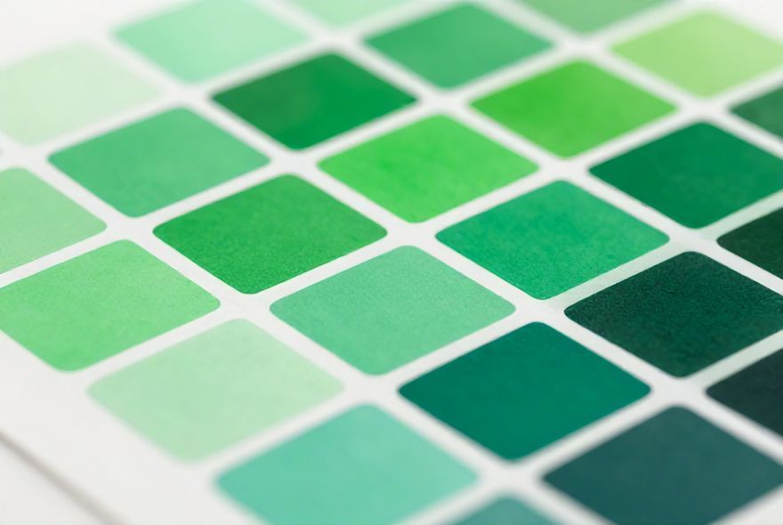
Testing and Refining Your Green Shade Selection Process
Okay, so you’ve got a rough idea of which green family your brand belongs to. But here’s where most brands mess up—they skip the testing phase. Choosing a green shade without testing it across different contexts, lighting conditions, and applications is like buying clothes online without checking the return policy. You might think you love it until you see it in the real world. The testing and refinement process is where theory meets reality, and it’s absolutely crucial. Your green shade needs to work on your website, in print, on social media, in person, under different lighting—the list goes on. Let’s walk through how to test and refine your choice like a pro.
- Context Matters More Than You Think: The same green shade looks different on a website versus printed materials versus a physical storefront. Digital screens emit light, while printed materials reflect it. Test your chosen green in every context where your brand will appear, from email headers to billboards.
- Lighting Conditions Change Everything: Artificial lighting, natural daylight, and evening lighting all affect how your green shade appears. A green that looks perfect under fluorescent lights might look sickly under warm incandescent bulbs. Test in multiple lighting scenarios to ensure consistency.
- Accessibility and Contrast: Make sure your green shade works for colorblind users and provides adequate contrast when used with text or other design elements. Approximately 8% of men and 0.5% of women have some form of color blindness. Your green choice shouldn’t exclude potential customers.
- Competitor Comparison in Real Time: Print your selected green alongside your competitors’ greens. See how it compares visually and psychologically. Does it stand out? Does it feel cohesive with your industry or distinctly different? This side-by-side reality check is invaluable.
- Customer Feedback Loop: Before fully committing, get feedback from your target audience. Show them your selected green in context (mockups, prototypes, digital renders) and ask specific questions about what emotions and associations it triggers. This qualitative feedback often reveals insights you’d miss otherwise.
Applying Your Green Shade Across Brand Touchpoints
You’ve chosen your perfect green shade, but the work isn’t over—actually, it’s just beginning. The real challenge is maintaining consistency while adapting your green shade across dozens of different brand touchpoints. Your website looks different from your packaging, which looks different from your social media graphics, which looks different from your printed materials. Each medium has its own quirks, color reproduction capabilities, and best practices. The goal is to create a cohesive brand experience where your chosen green shade is instantly recognizable, whether someone encounters it on their phone, in a store, or on a billboard. Let’s talk about how to maintain that consistency without losing flexibility.
- Digital RGB vs. Print CMYK—The Technical Reality: Your green shade exists in different color spaces depending on the medium. Digital uses RGB (red, green, blue), while print uses CMYK (cyan, magenta, yellow, black). The same green hex code will look different printed versus digital. Work with your designer to create accurate color specifications for both spaces.
- Brand Guidelines Are Your Green Safety Net: Document your chosen green shade in multiple formats—hex codes for digital, RGB values, CMYK percentages for print, and Pantone numbers for specific printing applications. These guidelines ensure that every designer, vendor, and partner uses the exact same green, maintaining consistency across all touchpoints.
- Packaging and Physical Products: If your brand has physical products or packaging, your green shade needs special attention. What looks great on a screen might not translate well to a label or box. Work with printers who specialize in color matching to ensure your physical brand presence matches your digital presence.
- Social Media and Digital Consistency: Social platforms have different color rendering capabilities. Instagram might display your green slightly differently than Facebook or Pinterest. Test your green across all platforms you use to ensure it maintains its integrity and impact.
- Environmental Adaptation Without Losing Identity: Your green shade might need slight adjustments in different contexts—a slightly brighter version for small digital icons, a slightly deeper version for large printed materials—but these should be documented variations, not random changes that undermine brand recognition.
Common Mistakes Brands Make When Choosing Green Shades
Let’s be real—brands make green shade mistakes all the time, and these mistakes can cost real money and damage brand perception. Some of the most common errors are surprisingly preventable. Maybe you chose a green that looks beautiful in isolation but clashes with your logo or other brand colors. Maybe you selected a shade that’s too trendy and will feel dated in two years. Maybe you picked a green that signals the wrong psychological message to your audience. The good news? Most of these mistakes are avoidable if you know what to watch for. Let’s walk through the red flags and common pitfalls that catch even experienced brand builders off guard.
- Trend-Chasing Over Timelessness: It’s tempting to pick whatever green shade is trending right now—maybe it’s a specific sage or a particular emerald. But trends fade. If you’re choosing a green primarily because it’s trendy, you’re setting your brand up for a refresh in two to three years. Aim for greens with staying power that will feel relevant five or ten years from now.
- Ignoring Color Psychology Alignment: One of the biggest mistakes is choosing a green shade that looks nice but doesn’t actually support your brand message. An eco-brand using neon green, or a luxury brand using bright lime green—these misalignments create cognitive dissonance for consumers. Always choose a green that reinforces what your brand stands for.
- Insufficient Contrast and Accessibility Issues: Choosing a green that’s too similar to your background color, or that doesn’t provide adequate contrast for text readability, isn’t just a design problem—it’s an accessibility problem. Brands that make this mistake inadvertently exclude customers and violate accessibility standards.
- Not Testing Across Color Reproduction Methods: A shade that looks perfect on your designer’s calibrated monitor might look completely different when printed or viewed on a customer’s uncalibrated phone screen. Skipping this testing phase can result in shocking surprises when your brand goes live.
- Overcomplicating the Palette: Some brands try to use three or four different green shades “to keep things interesting.” This almost always backfires, creating confusion rather than richness. Stick with one primary green shade and maybe one secondary accent shade. Simplicity creates recognition.
Future-Proofing Your Green Shade Decision
Here’s something worth considering—the world of color, branding, and consumer psychology keeps evolving. The green shade you choose today should be able to grow with your brand over the next decade. Future-proofing your green choice means thinking about how your brand might evolve, what cultural shifts might affect color perception, and how emerging technologies might change color reproduction. It’s not about predicting the future perfectly—it’s about choosing a shade flexible enough to adapt without requiring a complete rebrand. Let’s explore how to make your green choice resilient and adaptable.
- Choosing Greens with Timeless Appeal: Certain greens have remained relevant across decades—forest green, sage, and emerald have all stood the test of time. These classics work because they’re not dependent on specific design trends. They’re psychologically grounded and culturally significant across multiple regions.
- Flexibility in Secondary Applications: While your primary brand green should remain consistent, building flexibility into secondary applications allows you to adapt to trends without losing brand identity. You might add accent colors or adjust saturation in specific contexts while keeping your core green consistent.
- Sustainability and Material Considerations: As sustainability becomes increasingly important to consumers, the manufacturing and sourcing of your brand colors matter. Choosing greens that can be produced sustainably—whether in digital or print applications—aligns your color choice with your brand values long-term.
- Generational Appeal and Longevity: Different generations respond to different shades of green. Younger audiences might prefer brighter, more saturated greens, while older audiences might gravitate toward deeper, more muted tones. Consider your brand’s target demographic and choose a shade that will appeal across age ranges for maximum longevity.
- Monitoring Market Evolution: Stay aware of how competing brands’ green choices evolve, how consumer preferences shift, and how new applications emerge. This doesn’t mean constantly changing your green—it means staying informed so you can make intentional decisions about when (if ever) an evolution is necessary.
Making Your Final Green Shade Decision
After all this exploration, you’re ready to make your final decision—or at least you should be. Choosing the right green shade for your brand isn’t just about aesthetics; it’s a strategic decision that impacts how your audience perceives you, how you compete in your market, and how well your brand communicates your core values. You’ve learned about the psychology of green, what your competitors are doing, which shades work for different brand positioning strategies, how to test your choice, and how to avoid common mistakes. Now it’s time to bring it all together and commit. According to research on color in branding, the right color choice can increase brand recognition by up to 80%, so this decision genuinely matters. For deeper insights on color psychology and brand strategy, check out this comprehensive resource on green color selection. Let’s talk about how to finalize your choice with confidence.
- Create Your Final Decision Matrix: List your top three green shade options and evaluate each against your criteria: Does it align with your brand positioning? How does it compare to competitors? Does it test well with your audience? How does it perform across different mediums? Score each option and let the data guide your decision.
- Get Stakeholder Buy-In: Before finalizing, present your top choices to key stakeholders—your team, your target audience, maybe even your board if applicable. Make sure everyone understands the reasoning behind your choice and feels confident about the direction.
- Plan Your Rollout Strategy: Decide how you’ll introduce your chosen green shade to the world. Will it be an immediate rebrand across all touchpoints, or a gradual transition? How will you communicate this choice to your existing customers? A thoughtful rollout strategy maximizes the impact of your decision.
- Document Everything Meticulously: Once you’ve chosen your green, document it obsessively. Color codes, Pantone numbers, RGB values, CMYK percentages, usage guidelines, acceptable variations—get it all down in writing. This documentation becomes the foundation of consistent brand application.
- Commit and Trust Your Process: Once you’ve made your decision through this thorough process, trust it. Second-guessing yourself constantly undermines the brand-building process. Give your chosen green shade time to become synonymous with your brand. Consistency over time is what builds genuine brand recognition.
In this whirlwind journey through the world of green hues, we’ve uncovered how pivotal your color choices are in conveying your brand’s message. First off, selecting the right green shade can signal everything from eco-friendliness and growth to luxury, depending on the subtleties of the color you choose. A soft, muted green might shout ‘sustainable’ while a rich, deep emerald whispers ‘luxury.’ But here’s the kicker—paying attention to what your competitors are doing could either help you stand out or blend in, whether you like it or not. A careful analysis of their choices can guide you toward a tone that doesn’t just represent your brand but speaks to your audience in just the right way.
And now, with paints brushed and insights bright, if you’re itching to add a little more green to your branding endeavors, why not stick around a while? Dive deeper, explore further—color is, after all, a whimsical art. And when you’re ready to proudly wave your vibrant green flag, connect with us on Facebook, flaunt your shades on Instagram, or simply shout out in the ever-buzzy world of social media. Your journey to brand brilliance might just start with the right hue. Remember, green is not just a color; it’s a statement!


Leave a Reply